Friday, 24 January 2014

Research into corporate identities.

This mood-board was made to show imagery from Japan which mostly includes its ancient culture.

This is a mood-board for New Zealand and shows mostly tribal imagery.

The mood-board above is aimed towards Scandinavia and shows a range of images from most of the countries belonging to that group.

This is an image mood-board for the continent south america and shows a variety of images from the different countries that are involved..


This is the third page of research I conducted on airlines.

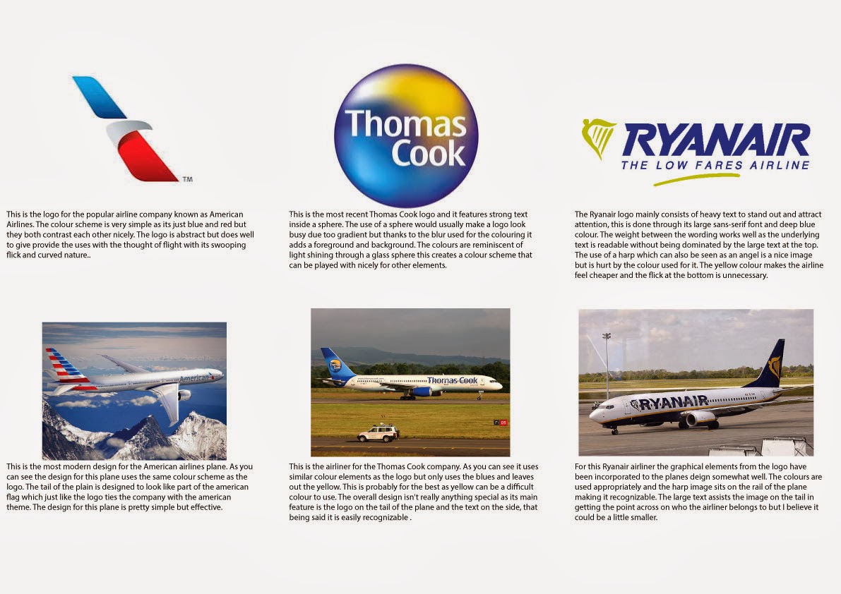
This is page two of the airline specific research.

This is the first page of research that I performed based only around airlines.


This is the second page of my corporate logo research.

This is the first page of my corporate logo research.

Corporate identity workshop

Final Picks
Website Home Page
Brochure

Business Card (Back)
Business Card (Front)


Website Design

This is a revised version of the original website design in which I made a few changes. The changes involved the pictures at the bottom and the font sizing, I also added some social media tools on the right hand side.

This is the first idea for the website design. For this one I felt I got pretty close to a final on the first go but it still needed a lot of work. The fonts are too large and the pictures could be changed to maximise the space. 

Brochure Design

This is my favourite of the brochure designs as it links with the business cards quite nicely with its geometric bottom border. This was also the one I picked for my final.

This was my second brochure design in which i decided to try and create a link between on of the business card designs and this to create a bit of unity. I'm not a big fan of how it turned out.

This is the first design idea for my brochure in which its main feature is the logo in the background this was a bit boring so I tried something else.

Business Card Development

This is the second design for the back of my business card and its pretty much what someone expects from a business card which is why I preferred the first design.

This is the first idea I had for the back of my business card and its the one I liked the most as it has a cleaner design than the second one.
This was the final idea I had for the front of my business card and this is the one I liked the most as it was more geometric and abstract than the previous designs.

This is pretty much the same as the last one but I removed a portion of the pattern to make the logo stand out a bit more as the last one.

This is a continued version of the pattern concept but I placed the whole logo on top of the image. 

For this one i used the logo shape to create a pattern in which I highlighted the centre piece to make it stand out.

This is the first idea I had for my business card front. I used the name Deltamedia and the font to create a pattern.

Logo Development

This is the final out come for my logo development.


Using my preferred colour scheme I experimented with different layout designs. The layout design i prefer is the one in the top right hand corner. Also I consulted a few of my piers that were present doing the creation of these and they voted for the same layout as the one I prefer.

This is the second page of colour variants. I tested a few times with the rgb colour scale in mind but these were not very fitting to the shape. I also tried to make the centre set of triangles stand out by using different colours.


This is the first page of colour variants in which i experimented with contrasting and monotone colour schemes.
The one I favour the most is the colour scheme in the centre.