Thursday 27 March 2014

website development and final

Above is an image of the final design for my website. I am happy with this design as i feel it serves its purpose as a user friendly airline site whilst keeping the themes and design elements that are used across all of my project outcomes.

I feel the placement for this design idea is a lot better however I feel its not complete so i will further develop it.

For this page of development I added some images which link to other stages of my website but I'm not too fond of the placement.


This is the first section of my website. From the get go I liked the bar and banner as they kept the same theme as the other design elements that are used in my designs. The advertisement box works nicely as it provides the idea of luxury getaway in an interactive and friendly website.


Thursday 20 March 2014

Boarding pass, Luggage Ticket and Safety Card

This is the final for the back of my safety card. Most the elements stayed the same as I was happy with them except I added the tittle of the plane.

This is the final for my safety card. The images have been comfortably resized and some text has been changed. I feel this successfully serves its purpose.

This is the back of my safety card and I liked the way it turned out. Just like the first side this image is understood by any one just through images. In the interest of language barriers I've left space at the bottom for translations and instructions for other language. I created the plane out of the technical drawing I used for my plane livery. I merely simplified the plane by deleting the details and I then changed the colour of the pieces.

This was side one of my safety card development. After creating all the icons, I placed them out in a method that is understood by multiple languages without the use of words. I believe this method works however I feel its a little too big.

As you can see my final luggage tags are the two i mentioned earlier. I feel these work the best with my brands theme and design elements. They clearly portray my brand name and are recognisable.

Above are the last two developed designs, I wasnt too fond of these two as the first one was a remake of the others and the second one seems a bit cheap and basic.

These are the developed designs for my luggage tags, I particularity like the first two as they seem to work the best. I will probably use the first two as finals. The others use elements created earlier on in my project. The shape of the tag was influenced by my research as it was the most practical style in terms of use and creation. I found the information fit nicely with the text.


I liked the initial designs for the luggage tags as the looked easy and simple to make.


These are images I collected that focus on existing luggage tags.

This is my final boarding pass design, its simply a revised version of the one i liked from the previous image. I added the finall bit of information and changed around the text a little to separate it a little better. In the creation of this final design I took a little inspiration from my mood board where the text is concerned.

These are the first few designs that were taken to the computer after my initial sketches. I liked the idea of the first and the last one as they are easy to understand and are both very simple. I like the last one the most though as i wanted to use the graphic on the left hand side of it in some shape or form when i first created it for my business card. 
This is a mood board I collected for Boarding passes.

Here I show some more initial sketches but these are to do with my boarding pass. The information for all of these designs are very basic and simple, this makes it easy to read and follow. The designs mainly focus on the left hand side of the of the passes because there is a tear of on the right hand side so by locating most of the design features to the left ive made things a little bit cleaner and easier to understand. The are a lot of features in all of these that relate to the previous products which thanks to my research this seams to make branding a little nicer.

Plane livery


This is a revised version of the design below and is my final livery design. I changed the text placement and put it on the tail, this way the plane isn't too cluttered. The characters have been moved to the top of the plane so they can spread out a little better. Just for the sake of colour scheme I coloured the wings red for obvious reasons. Finally i placed my logo on the side of the plane towards the front however I didn't put the text on this is because I'm using the image in the logo to associate different elements of the my Air Yokohama brand.
This was my first idea for my plane livery, as you can see it uses elements from my business card to relate them. I feel the text across the wings is a bit overkill and needs to be changed however i do like the Japanese characters on the tail of the plane.

Thursday 6 March 2014

Stationary creation and development

The image above is of my final compliment slip design and is also very similar to my a4 letterhead, it also possesses the same qualities. I like the organisation of this slip as it uses multiple elements but still doesn't look cluttered.

This development is for my compliment slip and is obviously related to the development of my letterhead but also has the same issues.

This is my final design for my a4 letterhead and is the one I like the most out of my two developed designs. It possesses the uniformity of my previous designs across the project and allows the company to be recognisable across all platforms. The bar at the top seems a little thick but when printed it comes across fine and not as dominating as I've worried it to be.

This is the first of two images that involves my a4 letterhead. This design is taken directly from my initial design however i feel that now ive seen it on computer I believe it to be a bit too boring but also lacks the unity my previous products provide.

These are my thumbnails showing my letterhead and my compliment slip ideas. The first three are for my A4 letterhead and the other three are for my compliment slip. As stated earlier I used some of the features from my business card to hopefully unify it with the other products and I think it works, especially with the first of each.
This is my final design for my business card, it is design to be built and folded into a origami resemblant card that stands on a persons table. I've created my business card like this so it doesn't come across as generic or boring. The colours and elements used tie in with my other products to unify them. Thanks to my research i found that the more unique business cards naturally stand out the most and this influenced my design.


This is one of the designs i liked more as its a lot simpler that the last few but also fits well as its just my logo with a banner.

This is the last idea i experimented with and I wasn't too happy with it, this is because just like the last one it loses its purpose in the surrounding shapes and doesn't fit my logo.

This is the second experimental design that I tried and it was of a more abstract version of my logo but the issue with this design s that i takes away from the airline theme.

This is the first of three experimental ideas. This one being a business card that fold into a plane. This idea is great in concept but not in reality as its extremely impracticle.


This is a revised version of the previous business card idea and is now placed on a horizontal card with the logo text added. I like this idea more but I'm not completely satisfied.

This was the first idea I had for my business card front, it was based around the idea of a vertical business card that follows the idea of traditional Japanese book structure. however I wasn't too fond of this idea and tried again. 

These were the first sketches i created for my business card. As you can see a lot of the ideas carried on to the development stage. The ones i liked the most were the 1st, 2nd and last two. The first and second ideas were simple and fit the japanese theme well by adding a uniformity design feature that could carry on to other elements of my project. The last two are one in the same and are my favourite as they are cut to the shape of my logo instantly making able to relate it to my other products.

Thursday 6 February 2014

Logo creation and development

This is my final logo. The main thing that's changed on this logo from the last one is that the origami crane is folded differently and adds a little more detail, it also provides a minor foreground and background feature that doesn't stand out a lot.


The image above was created to print of and present to others in the class during an informal pin-up critique session. I was informed by peers that the text I chosen (The top text on the right image) was the best one to develop further as they felt it worked best. I already determined the colour with the help of others so I didn't feel it was necessary to include variants in my pin-up.

For this page I continued on with colour experimentation but mainly stuck with red or pink colours. These were a lot more successful in that I liked the original dark red the best  (First colour variant).

Once I had the shape of my logo I tested with a few colour variants which I wasn't entirely font of. I also experimented with text and after consulting a few of my peers i chose the fourth font combinations it fit the best.


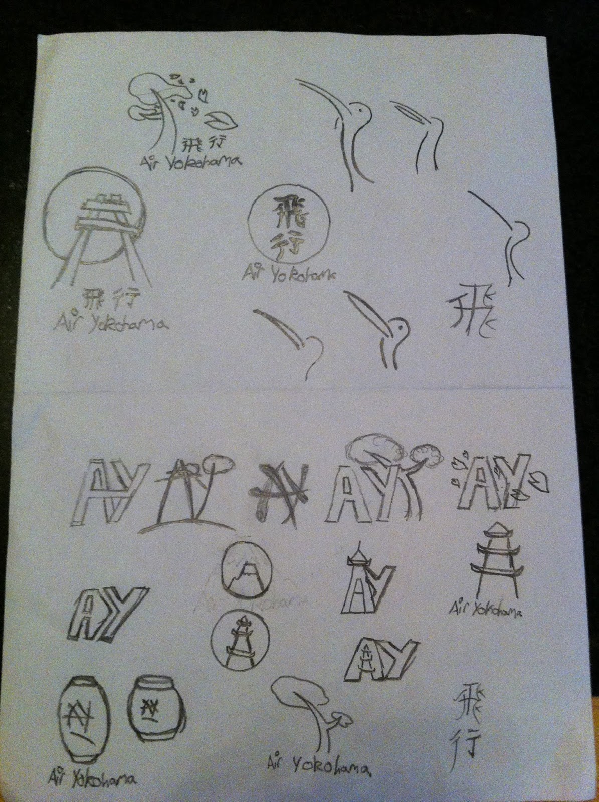
This is the initial development for my logo after I took my desired thumbnail onto the computer. The top left one is the initial shape for creation and the basis for my logo. The bottom left idea is the most similar to the initial sketch with a few exception, the first being the Japanese characters (Flight, Aviation) as they gave it that a better Japanese look. The second exception is the red dot separating the words and linking the text to the theme. The two on the right are combination of two initial ideas but I'm not as fond of these as I am the bottom left idea.

These are the japanese characters i painted to see if they could work better than computer typed characters. I decided against these because I felt they wouldn't suit my logo.


This is the original sketches that show my first ideas for my logo I liked some of these but I later decided on an idea I thought was a lot better suiting the theme of this project.
These are the second set of images that are based on a Japanese logo. These are my favourite of the sketches as they fit the theme the best. The idea of origami is traditionally Japanese and combined with the colour red, my logo will be instantly recognisable as Japanese.

Friday 24 January 2014

Research into corporate identities.

This mood-board was made to show imagery from Japan which mostly includes its ancient culture.

This is a mood-board for New Zealand and shows mostly tribal imagery.

The mood-board above is aimed towards Scandinavia and shows a range of images from most of the countries belonging to that group.

This is an image mood-board for the continent south america and shows a variety of images from the different countries that are involved..


This is the third page of research I conducted on airlines.

This is page two of the airline specific research.

This is the first page of research that I performed based only around airlines.


This is the second page of my corporate logo research.

This is the first page of my corporate logo research.