| This is my final logo. The main thing that's changed on this logo from the last one is that the origami crane is folded differently and adds a little more detail, it also provides a minor foreground and background feature that doesn't stand out a lot. |
 |
| The image above was created to print of and present to others in the class during an informal pin-up critique session. I was informed by peers that the text I chosen (The top text on the right image) was the best one to develop further as they felt it worked best. I already determined the colour with the help of others so I didn't feel it was necessary to include variants in my pin-up. |
 |
| For this page I continued on with colour experimentation but mainly stuck with red or pink colours. These were a lot more successful in that I liked the original dark red the best (First colour variant). |
 |
| Once I had the shape of my logo I tested with a few colour variants which I wasn't entirely font of. I also experimented with text and after consulting a few of my peers i chose the fourth font combinations it fit the best. |
| This is the initial development for my logo after I took my desired thumbnail onto the computer. The top left one is the initial shape for creation and the basis for my logo. The bottom left idea is the most similar to the initial sketch with a few exception, the first being the Japanese characters (Flight, Aviation) as they gave it that a better Japanese look. The second exception is the red dot separating the words and linking the text to the theme. The two on the right are combination of two initial ideas but I'm not as fond of these as I am the bottom left idea. |
 |
| These are the japanese characters i painted to see if they could work better than computer typed characters. I decided against these because I felt they wouldn't suit my logo. |
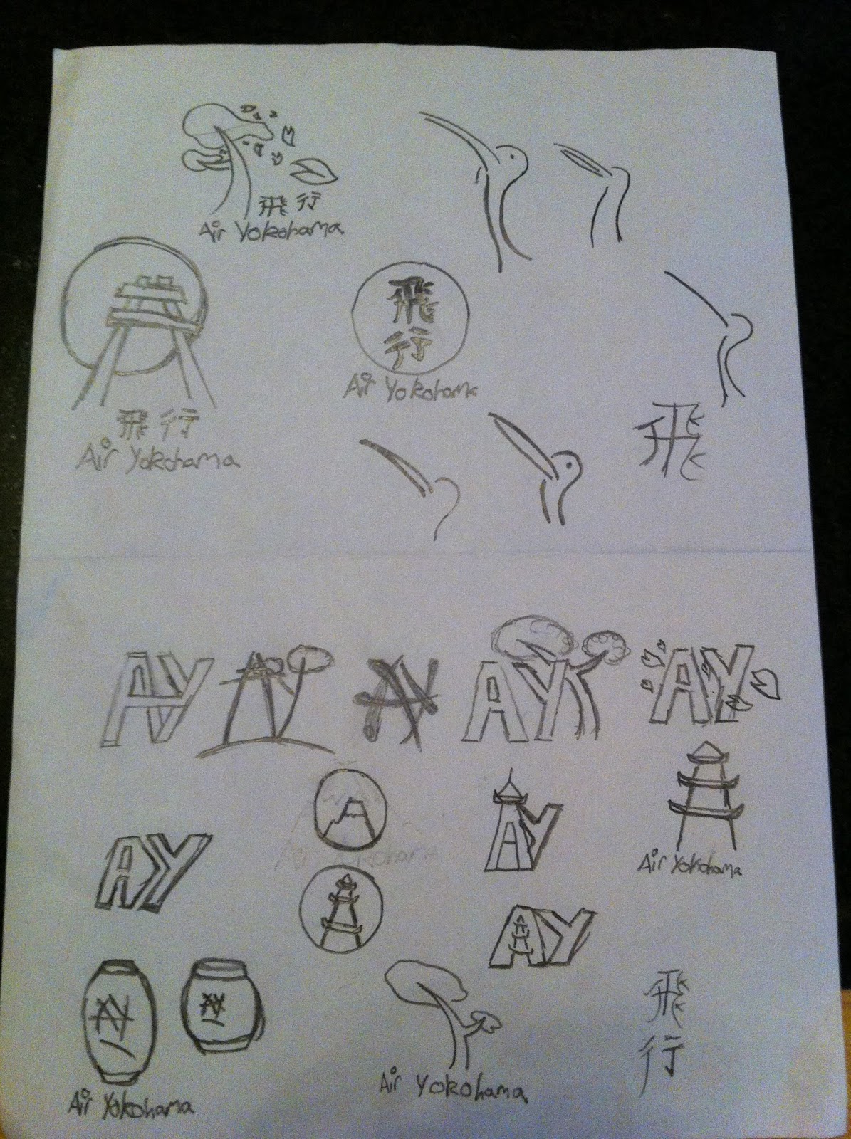 |
| This is the original sketches that show my first ideas for my logo I liked some of these but I later decided on an idea I thought was a lot better suiting the theme of this project. |
 |
| These are the second set of images that are based on a Japanese logo. These are my favourite of the sketches as they fit the theme the best. The idea of origami is traditionally Japanese and combined with the colour red, my logo will be instantly recognisable as Japanese. |
No comments:
Post a Comment